Tuesday 23 July 2013


Stereotypical tourist pose
 This photo was good for the typical tourist pose because we have Stephine looking at a map Ekat taking a picture and Ryan looking all confused. 

Hot and steamy
This one is hot and steamy because the clock was steaming when I took the picture and I used the rule of thirds in this one I out the clock in the left corner of it.

Wheels
 I used angle of view and also kind of leading .lines in this photo the edge of the side walk leads your eyes from the first wheel to the second one
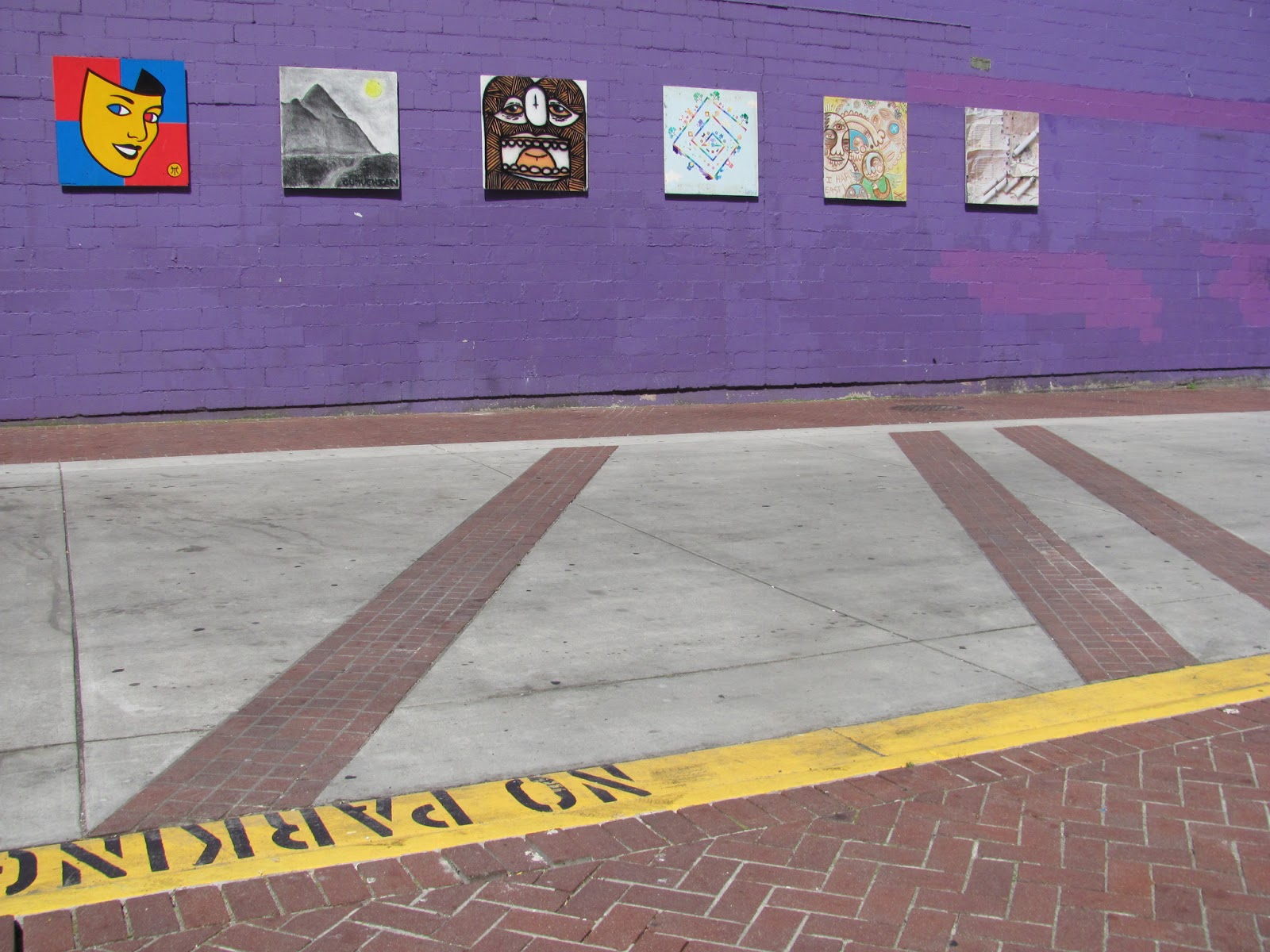

 Automobiles
I tried to used the rule of thirds in this one it worked for having the picture more to the left side but I should have had it either higher or lower I think.

 Gaolers mews
I used rule of thirds in this one again and there is some nice contrast of texture and color I really like the green against the old brick and also the pipe on the right side is actually in the rule of thirds too.

 Gassy
In this one I'm using rule of thirds again and also angle of view I crouched down really low to get this photo. 

 Stairs
 Park
 New vs Old
This is the new vs old photo and for this one i'm comparing the two buildings in the back the one on the right is new and  the left is the old one. 


 Grit
One of the things we had to get a photo of was grit when I hear grit I think of dirt I was standing in an ally and looked up and saw this and had to take the picture I'm using angle of view for this one.

 W

 Working hard
 
Okay so for this one we had to take a photo of someone ''working hard'' and I saw this construction worker just sitting there and thought it would work well for this lol working hard or hardly working!


Original


 Edited
 
First I enhanced the colors in this photo but everything was so bright so I darkened the bricks. I used the rule of thirdsthe focus part is up near the top and there is also some leading lines in this photo too the the brick strips leading to the wall wich makes you look at the pictures on the bright purple wall.

Thursday 11 July 2013


Contrast
This is what I chose for contrast because there is a lot of contrast in color and also with the water wood and grainy texture of the ground.

Texture


This photo is what I decided to use for my texture because of the texture of the water running off the wood and drizzling down to the ground.

Repetition
 This is my repetition picture all my ducks are in a row in the photo witch creates repetition and also its very cute the ducks just following one another. (:

 Angle of view
And last but most certainly not least I have these roses for my angle of view photo I got real low under the flowers and took this photo and tilted the camera a bit this is one of my favorite pictures because the flowers look so very big and important.

 Framing   
This photo is a good example of framing because the little bridge thing and the pillars at either end frame the water shooting out of the sprinkler thing I had a few different ones i could have used for framing but this was by far my favorite because it looks so natural.

 
 Depth
 I chose this one for depth it may not be the best example of depth but it was the best one i took that day it shows depth because there is the branch at the front leading you to look at the little bush then to the next tree and so on


  Scale
This one shows scale because you see the poster bored put up as such a huge drumstick but than we have the real thing right beside it and there is a big size difference. 

  
 Simplicity
 This one was what I picked for simplicity just a leaf coming off the side of a plant so sweet and simple the leaf is very small and in focus and everything around it is slightly blurred. 

Wednesday 26 June 2013

Rule of thirds

for my rule of thirds photos there very similar to each other I did this one with the horizon on the lower part I left a lot more sky in it and my focus is on the left side where the little boat is cruising by 
for this one I have my horizon up in the top of the picture and a lot more of the water with the focus point on the right top corner .
and for this one its kind of like the first photo but the focus point is the little bird on the left.

Leading lines

In my first photo I really like how I'm using the leading lines and the rule of thirds at the same time if my focus was in the center this would not be nearly as strong of a photograph, I think if I would have made the horizon lower or higher it may have been better because its a little too centered but other than that i really like this picture.
In this one I really like how the railing leads your eye right to the bridge in the distance and also lines up with the fence there on the side i perhaps should have used a bit of the rule of thirds in the photo its very centered in this one.
And for this photo I really like how the lines are leading up to the opening at the top of the latter and also there is some repetition with the circles going up its a very neat angle.

Wednesday 12 June 2013

 white balance is auto


 white balance is fluorescent


 white balance is tungsten


 white balance is auto


 white balance was sunny


white balance was cloudy 


In the first two I cant really see much of a difference at all, but in the third one I used the tungsten setting so it has a blue tinge too it, I think that the first three look so dark because I have light coming from behind it so its kind of shadowed I actually like the third one best out of the first three I think the blue is kinda cool. The last three I also dont see too much of a difference except the black part of the wall behind it I can see a slight difference in the color. I tried to use the rule of thirds mostly in the first three but also a bit in the last three. i like the last three better because i can see all the detail on the flowers that were drawn onto the mug and the actual daylight makes it better too.